Sunday, February 21, 2016

Color Block T-shirt / The "Sam-Bell"


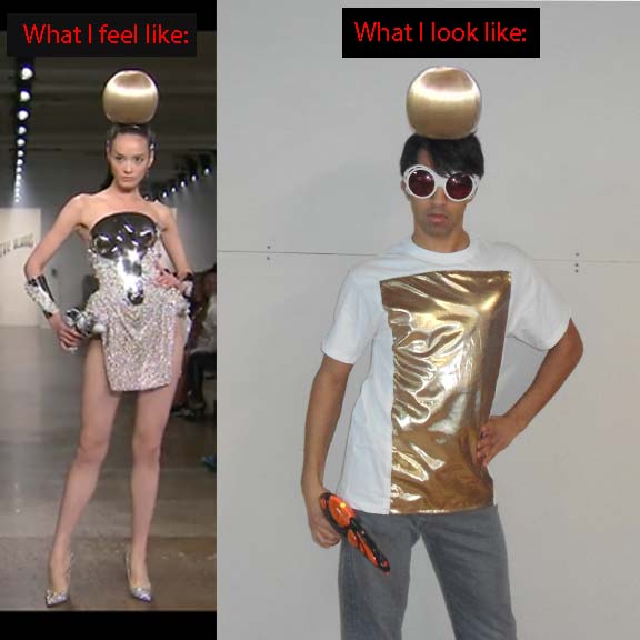
New Years!  2016 is going to be great, and what better way than to celebrate with something sparkly!  "It's not lame, it's lamé!"

The  story goes like this: I did not have any plans for New Years.  Then my work friends decided to go bowling.  I was invited, but I did not have anything that would pop!  So I made this color block t-shirt.  Unfortunately plans fell through, and I didn't go bowling. But I decided to name this project after my co-worker who was really nice to invite me so that I would not be bored on New Years Eve. Hence, the birth of the "Sam-Bell."


Top: The Blonds SS'14
Bottom: Auld's All-Star Finale

I was inspired The Blonds SS'14 and Anthony Ryan Auld's Project Runway All-Stars 2 finale collection.


This is roughly the pattern I used.  Note, the lamé/underlining cut line extends beyond the base of the t-shirt because you fold it under to have a finished hem.


The above set of pictures shows a bit of the process.  Basically you cut a trapezoid out of a t-shirt, cut a trapezoid of lamé, and put the the lamé piece in the t-shirt.  The lamé I used was a woven fabric that was a bit scratchy and frail.  So I used another layer of fabric (the underlining) to soften the feel and strengthen then shirt.  To finish the edges, I used glue.  Wa-wa.... Probably not the most professional method, but E-6000 really works well when you want to go fast.


And as usual the following pictures are just a bit of fun!  Enjoy!


Sunday, April 26, 2015

Chudley Cannons Jersey


The dress code at my old work place was "business casual" (no denim, no Ts, no sneakers).  However, during the month of September, all Sundays were "NFL Jersey Days."  Employees were allowed to wear a jersey to support their favorite NFL team.

I do not follow football.  So I decided to put my own spin on it!  I figured that I would support the worst team in the history of... Quidditch!

There are two parts to this project: the shirt and the print.

1) The Shirt
The easy way out is going to the athletic department of any department store and buying a $10 performance shirt in a color of your team.  However, I used this opportunity to learn how to make shirt from scratch.  I wanted to develop working with knit/stretchy fabric.  


A) The primary skill I learned was making the collar of a shirt.  It's all about knowing how to stretch material.  I used this video as my guide:
http://www.threadsmagazine.com/item/3839/video-a-neckline-binding-for-knits

B) Another thing I learned is that the front and back pieces are identical.  The only difference is in the neck opening.  In garments made out of a woven material, the back piece is a bit longer.


C) For the sleeve, I really like the padded elbow look.  It adds a sporty edge.  To add this patch, I used a lot of tape, and then I zig-zag stitched around the circumference.  In terms of placement, I added it in the middle of the back side of the sleeve around where the elbow is.  I placed the center of the patch about 1 inch lower than the elbow point because the sleeve rides up when you bend your arm.  

I have a couple of critiques on the patch.  The first is that I should have made the patch larger.  The second critique is that I needed to stabilize the patch before sewing the patch to the sleeve.  Tape is a great method, however it is hard to remove.  Next time I would add interfacing to the patch before sewing.

2) The Print


I watch a lot of DIY videos on youtube.  These videos taught me about fabric you can print on with a regular home printer.  I knew that this would be the way to customize my shirt.  Here are a few videos you can watch to learn more about the fabric:
https://www.youtube.com/watch?v=DxtexpJP2LQ&spfreload=10
https://www.youtube.com/watch?v=niaQ8I_yebY&spfreload=10

(NOTE: I did not use the brand of paper seen in the videos.  I used the brand that was available at my local craft store.)

I made the logo and numbers on Microsoft PowerPoint.  (You could also buy iron numbers.  I decided to make my own numbers to get the size I desired.)

After ironing the print to the shirt, I stitched over all layers to make the print stay.  The yellow dashed line shows my stitching line; in reality, I used black thread.
I used iron-on letters in the past to make a shirt for my friend.  The shirt turned out really nice, but my friend said that the letters eventually peeled off.  Even with this shirt, I noticed that the corner of the "7" started to peel off.  So I stitched down all of the printed parts for extra support.   This extra stitching was great because it made the shirt look more like a professional jersey.

I'm so glad this project turned out better than I expected!  I really love the way it turned out!  


As for work, I wore it on the Sunday I was scheduled... and nobody commented on it.  I was worried that I was in trouble, so I asked by manager about it.  I explained my situation, and the manager just laughed at me.  She said that I was totally fine and that people just did not get it.  What?   I think I need to become a Harry Potter missionary because clearly there are people who are missing out on a great story!  Or maybe I should become a recruiter for the Chudley Cannons because, dang, they need some better players!

Friday, November 21, 2014

Pokemon Torchic Hat

In honor of Pokemon ORAS, I present to you my new favorite hat!


I do not own this image of Torchic.

Torchic is one of the cutest most kawaii Pokemon out there.  It's definitely one of my favorites from Generation III.  Also, there is a 1/3 chance that every new trainer in this region will start with this 'mon.  So what better way to celebrate this awesome occasion than making an awesome hat based on an awesome Pokemon?


For the base, I used the FREE pattern provided by TheCraftyGemini.  There are child and adult sizes, so you can choose accordingly.  In terms of fabric, TheCraftyGemini uses 2 layers of fleece.  I used an outer layer of fleece and an inner layer of knit jersey.  I chose to make the inner layer a jersey knit to avoid annoying static (I highly recommend this route). Go check out TheCraftyGemini's video!

In case anyone cares, the dimension of the plume is 3 1/4'' x 6 7/8''.  Yes, at this height, my hat does reach the top of the car when I drive.

I made the patterns for everything else.  There was no specific science to this process.   I just had to make sure that 1) the patterns were symmetrical and 2) the base was wide for stuffing.  The small "feather" was very difficult to cut; I tried 4 times to get it right.

A) Top view of hat.  B) Front view of hat.  The sewing line for the plume and beak respectively is indicated by the red dashed lines. 

Sewing on the plume and beak was the main challenge, especially the plume.  I knew that I wanted the plume to stand up.  The easy method to add attachments (like ears) is to sew them right into the seam.  This works best if the attachment is small.  However, the plume is quite large and has more potential to flop over.  So, I used pillow stuffing to give the plume depth and a base (I treated the plume like a pillow).  Then, I slip stitched the base of the plume onto the top of the hat (A).  It will feel like sewing in a rectangle.  I could have sewn the beak into the seam.  However, I wanted my Torchic to look more alive.  So I sewed my beak pieces in a diamond shape (with the top extending higher).  I used stuffing in the beak as well.  This process worked really well for me.  One thing to note is to use a generous amount of stuffing.  This will give the plume strength.

The hat before the eyes or beak were added.  As you can see on the computer,  I looked at a lot of Torchic pictures.  I even looked at other Torchic hats! What a HOT trend!  They are on FIRE! (Okay, I'll stop.)


In anime, eyes are really important.  Eyes are a huge indication of whether a creature/person is cute/fierce/derpy.  I've seen many Torchic hats out there that look really derpy because the eyes are constructed so poorly. For Torchic, the key is to make the eyes large, slightly tipped in, and correctly placed.  As you can see from the above picture, I used tape to figure out the right position before using E6000 to tack them down.


To finish the ties, I cut some trapazoids; sewed the non-parallel sides together; popped the straps through the small hole; made sure I liked the length I wanted; sewed over all layers on the small side; cut the excess strap; flipped the trapezoid down.  (Did you follow?)

I do not own this image of Torchic.

Can you tell I'm really happy?

Friday, September 6, 2013

Fish Print T-Shirt


The man in the above picture is my cousin who lives in Denmark.  He loves anything to do with fish.  Because of this interest, I decided to make him a marlin inspired t-shirt!  This is my second venture into a printed t-shirt.

The last time I made a printed t-shirt, I made a stencil to get the pattern on the shirt.  Later, threadbanger came out with a video about a DIY spiked pants project where they printed anchors onto the pants.  To print the anchors, threadbanger made a stamp out of a potato.  Genius!  This method is perfect for printing a simple motif.

Here's threadbanger's video:
http://www.youtube.com/watch?v=BiGsCBqHEsc


The first thing I needed to do was figure out my pattern.  I knew I wanted something dynamic and aquatic.  So I came up with a fish that would look really cool diagonally.  (Note: diagonal lines make things look more active.) This fish was the motif for my design.

The next step was transferring that motif into a stamp.  After finalizing the motif, I drew grid lines on the motif so that I would know how to place it.  Then I cut out the motif (with grid lines) and stuck in on the potato and made a stamp (Figure 1).  The I added notches that line up with the grid lines so that I would know how to place the stamp.

Figure 1: The motif on the potato.  The notches are the triangle cut out pieces on the edge.

Next I did a little trial on an old shirt (Figure 2).  My heart dropped because I forgot the most FUNDAMENTAL RULE of making a stamp: the image flips (makes the mirror image)!  I totally forgot to flip the image before cutting it out.   This mistake was okay because the nose pointing up looked a lot more dynamic.

Figure 2: My test.
The next step was to prepare the actual t-shirt (Figure 3).  I drew a grid on the shirt was washable marker so that I had a guide for placing my stamp.  Then I placed dots in the places where the stamp would be placed.  The pattern is a BRICK REPEAT (looks like a brick wall).
Figure 3: Preparing they shirt.  I emphasized the lines and dots in this picture on PowerPoint because the original marks were not showing up really well.

I lined up the grid lines with the notches in the potato to get the perfect placement (figure 4).  Because of this system, the whole stamping process went so fast.
Figure 4: Matching up the grid lines and the notches in the potato.

Figure 5 just shows progress and the mirror element of stamping.
Figure 5: Progress.  Notice how a stamp makes its mirror image on the surface of the project.

I think the shirt turned out great!  It looks really active and sharp. 


Wednesday, July 31, 2013

Rain Jacket


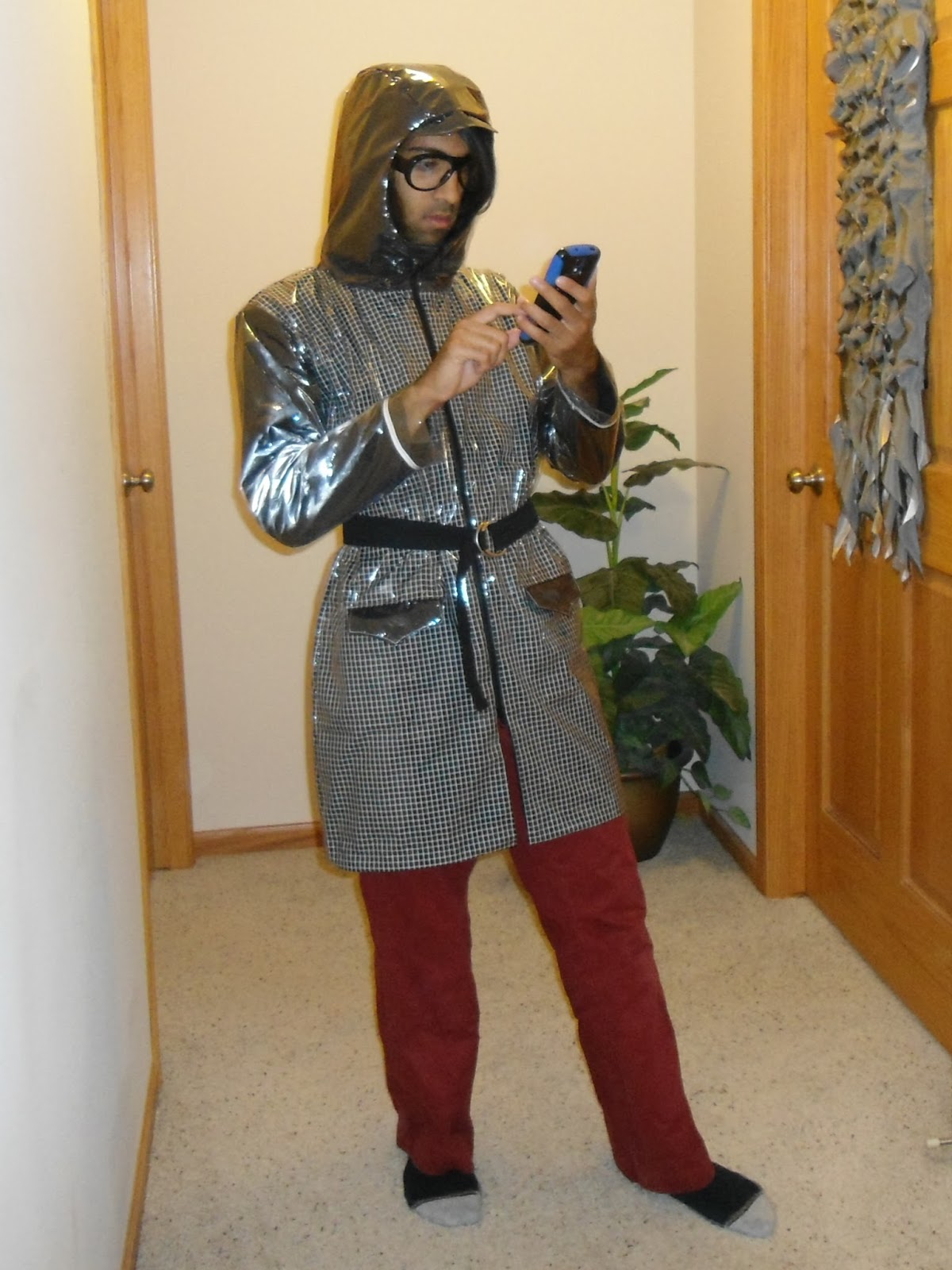
 I'm going to Oxford, UK to study abroad.  Because of the everyone says it only rains in the UK (stereotype), I thought i would be appropriate to make a rain jacket.

This project nearly killed me.  I thought it would be simple because this jacket was essentially just the rub-off sloper I made with a couple easy added elements: pockets and a hood.  Nope; the hood took me days to figure out, even though I did it before, and the plastic material was almost impossible to work with.  This jacket took me an extra week to make.  That's a little embarrassing.  I might not even take the jacket because it's so fragile (sewing the plastic basically just made it like perforated paper).  I'm not happy.

ELEMENTS:
Hood:
The hood was just frustrating.  It took me many appempts and days to get to something I really wanted.  I wanted a hood that covered the neck and still conformed to the head.  I did a bit of research, and the ARCTERYX company made jackets with the hood I desired (figure 2).  My first attempt (trial 1 in figure 1) was just off.  I was not too disapointed because it was my first trial and mistakes were bound to happen.  My second attempt (trial 2) was even more off.  This is when I started to get pissed.  I thought all of the mistakes from the first trial were corrected, but I made the situation worse.  Then I realized that I was going about the hood the wrong way.  I was just going off of the neckline.  However, I didn't realize that I needed to make a BUILT UP neckline.  So in my third attempt I built up the neckline a bit... and it still didn't work.  I was really upset because I still didn't have a good enough hood.  But, what kept me going was that I was going in the right direction.  I needed to build up the neckline more from the center front. In my fourth trial I was still a little off, but the hood was in the shape that I wanted (or close enough anyway).  All I had to do was make a few fitting adjustments (seen with the pins).  But alas, I had a hood that I was satisfied.
Figure 1: The four trials I needed to figure out the hood.  I was not happy throughout this process.
 Looking at the comparison between my hood and Arcteryx's hood (figure 2), I think I needed to add a bit more to the back (make it more scooped) and build up the neck more, but I'm satisfied for the time being.
Figure 2: Comparison of Arcteryx's hood and my hood.

Plastic:
Well, I wanted my jacket to be water-proof.  I was too cheap to buy water-proof fabric, so I just bought vinyl and put it over regular fabric.  This was a big mistake because sewing the vinyl made it unstable.  If I sit the wrong way, or stretch in an odd way, I'm afraid that I might pull the plastic out.
Figure 3: Putting vinyl over fabric
Pockets: 
I really like welt pockets, and I've never made them before, so I thought this was the right time to make them.   Note, I had to put paper over the plastic so that I could top stitch (otherwise the garment would get stuck on the foot).  Also, I had to take everything in place, NOT PIN.  Pinning would make permanent holes.
Figure 4: i had to put paper over the plastic so that I could top stitch.

I thought the pocket it would be a good place to add a little surprise with a pop of color (figure 5). I thought it turned out great!
Figure 5: The pop of color under the pocket flap.  My favorite part about this jacket.
Seam finishes:
I thought I would simplify my life by not adding a lining (the fabric under the plastic is an "underlining").  To finish the seams, I thought I would bind all of the edges.
Figure 6: The edges were bound before I attached them together.  This series made the process go a lot faster.
Vent:
I wanted to add a vent because they are classy.  However, I couldn't think of a way to make a neat vent with out lining . So I decided to line only the vent!  After making the vent, I stitched the lining to the underlining.  This way the vent remained classy and clean.
Figure 7: the vent lining pinned to the underlining.
Zipper shield:
I added a zipper shield so that the zipper would not get caught on my clothes.
Figure 8: Zipper shield under right hand.

RANDOM PICTURES:

Figure 9: The vent, pocket, an hood in action


Sunday, July 14, 2013

Kurta


Weddings are the best occasions for beautiful extravagant clothes.  My family was invited to a wedding this summer, and I decided to make my own extravagant clothing.  Because this wedding was and Indian wedding, I decided to make a kurta, an Indian garment.  Following the pattern I took from the kurta my cousin gave me (more HERE), I made this kurta!  I pretty pleased with the result.

Figure 1:  Casually standing around with hands in pocket
I added pockets to this garment for functional reasons.  The pockets are a type of side pocket that is tacked down on both sides of the garment.  I took this idea from the original garment because the pocket lies flat (does not become bulky on one side), yet the pocket contains a lot of space.


NEW DESIGN ELEMENTS: Sequins and Opening
Following my discussion from last time, I needed to add new elements to make this garment my own.  Without these elements, the garment would be a direct copy (not okay).

SEQUINS:
I wanted something flashy, and I really wanted to work with sequins and beads.  I did a lot of research (surfing the web) to find out how to add sequins and beads.  I ran into this following video which shows the Chanel's process for making a couture garment:
http://www.youtube.com/watch?v=lttB10ne37I
In the video, the machinists added the beads/sequins with a hook like tool. I found other videos of people adding sequins to saris using the same method.  I later learned that the tool the people were using is called a TAMBOUR HOOK.  Basically the hook works like a crochet hook.  The artist makes single chains through the garment while adding the beads/sequins in those chains.

I looked around to see what to purchase, and I came across the Clover company which sells a similar hook ("Kantan Couture" Bead Embroidery Tool) and a specialized hoop made for this type of embroidery work.  The clover hook is really helpful for beginners because there is a specialized latch that helps guide the process.  Also, the Clover hook is larger than tambour hook, which also helps guide the process for beginners.  There are youtube videos out there explaining how to use the product.  [I should really look into getting sponsored....]

Figure 2 shows the pattern I was playing around with.  After figuring the placement of the sequins, I mapped out the pattern and traced it onto the fabric.
Figure 2: Arrangement of sequins and beads.  This helped me figure out the pattern I wanted to add.

Here's a video of me adding the sequins to this garment (I did not want the sequins to overlap over each other, so I left an empty stitch in between each sequin):


OPENING:
My favorite part about the garment is the opening. Usually kurtas have a placket going down the center front (kind of like a polo shirt).  However, I wanted my pattern to be very bold.  So, I engineered the opening to be on the shoulder seam (Figure 3).
Figure 3: The opening is in the shoulder seam.  The left picture shows the garment closed.  The right picture shows the garment open. 
To engineer this opening, I had to extend the shoulder seams by the size of the button (both front piece and back piece).  Then I overlapped the pieces before adding the sleeves (Figure 4).  The front and back piece line up over the original seam.
Figure 4:  This view shows overlap.
DISCUSSION:
I thought I would show the inside of the garment because there are important discussion points.
1) Because of the different type of opening, I needed to add a facing to keep the opening finished.
2) The inside of the front piece (Figure 5) is white because I did the embroidery over two pieces of fabric, white on the bottom and yellow on top.  I did this to add more stability to the garment.  Originally I added sequins to just the yellow fabric.  After adding the first diamond of sequins, I noticed that the fabric was way too wavy.  This would not have allowed the middle diamond of beads to stay flat on my chest (bumpy chests: not cool).  So I took everything out and restarted with the two layers.  The overall piece was less wavy, but it was still not perfectly flat.  I think the issue was two fold.  First, I was pulling on the string too much. Second, the hoop is too small for the hole design.  This is a problem because every time I re-adjusted the hoop, I would stretch the fabric in a different way.  To fix the second issue I might need to make my own large hoop.
3) The beads in the center were stable with one layer of fabric (I did a test before this piece).  The second layer just added more stability.
4) This only thing I would do differently is line this inside-front so that the stitching would be covered up.
Figure 5: The inside-front of my kurta.

And here are some fun pictures for you to enjoy: